
BREAKING NEWS: The new TWiT website is live and it is one confusing messy pile of HTML.
Months in the making, Leo couldn’t stop squawking about how amazing and cutting-edge the new site would be—and let me tell you, it is nothing short of underwhelming.
Costing a reported $350,000, it’s a bloated, bewildering junk pile of a revamp. Even Chad Johnson’s Giz Wiz website blows it away in terms of an elegantly finessed portal to content.
Please comment about what you think is wrong with the site, but for now the editorial board at TotalDrama has compiled this short list:
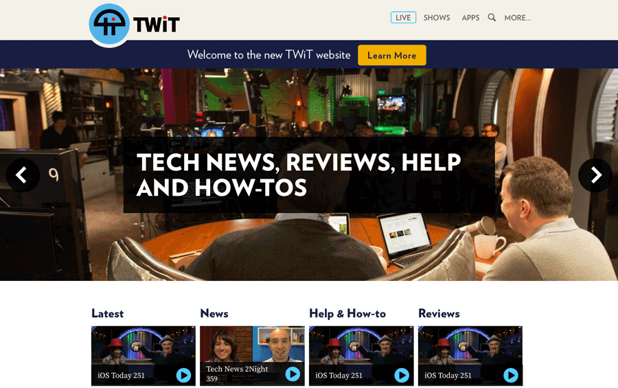
- The image carousel of “hero” images is too fast and is confusing. Read this for a perspective on why this is just plain bad.
- Text covers up the middle of the photos, at one point an ugly black box covers the back of Leo’s head as if attempting to slice through his brain.
- The TWiT logo on the upper left is a jagged disaster (one would think that $350K could by a properly anti-aliased alpha-transparent PNG).
- Not one person of color appears on the homepage. So much for diversity.
- The cartoons on the “Shows” link are a jumbled wreck of amateur-hour kindergarten doodles that appear nothing like what the hosts really look like.
- More critiques to come, but for now, just repeat this number out loud: $350,000.00. That’s what this disordered muddle cost.
The carousel might have actually served a purpose if it provided links to ANY pages…..but it doesn’t. It’s just a design method used to take up 80% of the page to show pictures which serve no useful purpose.
Also, the ‘buttons’ for viewing past episodes are pretty useless. Other than putting your mouse cursor over the image (which won’t work on touch only devices) to give you a cursory description of the show, the viewer has no idea what the episode is about. The only thing displayed is the show’s name and episode number. You need to click on the image to go to the episode’s page to find the show’s description. If it’s not what you’re looking for, you have to go back and select another one. Not the right episode, repeat steps AGAIN. At least the auto-play has been turned off.
Marcus» Quote comment
The site was suppose to work on all devices. I don’t understand why they did not pick a small group to test it, or better yet, upgraded the existing site little by little.
Jacob Martin» Quote comment
The schedule on the old site was dynamic, in that if you were on the East Coast, it would provide you with the proper show times for your Time Zone. On The new website you have to find it, and then hope it loads. I only tried it on my iPad, because Leo said the website would be the same for all devices, it isn’t. The Apps section has a bunch of guess, and old information that does not apply anymore, specially since some of those App used the RSS feed. The new website was suppose to use HTML 5 for video, but it uses flash invalidating video instructions for some of those “go to live.twit.tv” instructions. In general the website contains less information at a glance, and requires more searching for information, which is funny with BrainTree being a sponsor, since their whole thing is that people abandon sites that are too difficult to use.
Jacob Martin» Quote comment
It looks like it’s still a google calendar. If you add it to your existing google calendar (can be toggled on and off) it will show in your timezone.
NotThatGirl» Quote comment
I’m sorry but what is the bloody point of the carousel? I thought everything above the fold was suppose to be important? Do they really need to have those huge images to fill up the page?
Are there any web designers who could give us a quote on what something like this would actually cost to make?
On the plus side I’m happy to see they removed the donate/amazon links
Mach» Quote comment
I think someone POCed the carousel to Leo on a tablet and fupa boy immediately cut a blank cheque faster than he could inhale a burrito.
The Patrick Klepto» Quote comment
An Amazon links is still around, kind of, at the bottom of the “Advertise on TWIT” page.
DatGuy» Quote comment
Based on the look and usability, it sounds like they spent the biggest chunk of the budget on the API.
NotThatGirl» Quote comment
I just noticed that they added pictures of Leo to the Ustream buffer animation.
Jacob Martin» Quote comment
It’s what I have come to expect .
Exodus» Quote comment
live.twit.tv appears to be half in the old site, and half in the new site.
Jacob Martin» Quote comment
Sorry dear anonymous drama queen: at Twit there are many things going wrong. Good hosts left, boring hosts were hired. Wrong Sponsors are schosen. But the new website seems to be very good. At first glimpse it looks clean, stylish and useful. Youre hateful remarks are missing the point. If ever you would become the target of another total drama queen you might understand my comment.
Clye F.» Quote comment
Would you say it is 350K worth?
Jacob Martin» Quote comment
The Tech Guy isn’t real bright about tech, I wouldn’t pay $350.00 for this.
Mark Harry» Quote comment
It’s absolute crap. I just went on there to see what time Windows Weekly starts. My first attempt gave an error saying “failed to load calendar”. I refreshed about 10 times before it gave me a calendar and then it was in pacific times and not local UK time which it is supposed to auto detect according to the site.
Dusty» Quote comment
Why was Hilton removed from the people page?
The black box with the text needs to be lighter, its too black and you cant see what is under it . I am sure that will get fixed fast.
Ghsotdog» Quote comment
someone needs to reach out for comment
DTO» Quote comment
Leo doesn’t do anything fast except maybe calling room service or exposing his penis.
The Patrick Klepto» Quote comment
“The TWiT logo on the upper left is a jagged disaster (one would think that $350K could by a properly anti-aliased alpha-transparent PNG).”
Well that’d taken another $50,000 and well, those Segways weren’t going to pay for themselves were the….
…… oh bugger I misplaced the decimal point…. I meant $0.05 :/
G0Ph4R» Quote comment
No obvious place for comments, positive or negative
Charles Chadwick» Quote comment
Obviously, no dissent is allowed.
Mark Harry» Quote comment
Forget the fact that no one of color appears on the homepage, there’s not one person of color ANYWHERE! “Net casts you love from WHITE people you trust.”
Morris» Quote comment
No people of color, for fucks sake, what about:
– Tony Wang
– Brian Chee
– fat priest
???????????????????????????????
Dixie Rect» Quote comment
They could have made that page within minutes of downloading 960 Grid… It is so sad that the over all design from the font to the layout to the color contrast is basically a duplication of https://fourkitchens.com site itself. I would pay them with one expired $5 Starbucks giftcard… So sad…
BannedSupportingErikLanigan» Quote comment
whose idea was this and why did they have to go to TEXAS to get it done?/ weird.
The Peacekeeper» Quote comment
The Texas location was chosen because Lisa wanted a little getaway with Leo, alone. Leo then had to go open his large soup trap and suggest a meet-up with the 6 fans living in the lone star state and the bookkeeper in Lisa figured the trip could be a write off. You’ll note at the time, many more meet-up were proposed, but, as with all TWiT ideas, they never took place.
John» Quote comment
Lol, 960 grid. There’s a blast from the past. Any modern design framework could bangout the frontend of the new site pretty easily. The backend could be wired together with rails pretty quickly too. I think a lot of the cost was in the video to stream system.. But I don’t know.
FraggleRox» Quote comment
PLAUSIBLE
The Patrick Klepto» Quote comment
bla bla bla mobile responsive bla bla bla mobile responsive bla bla bla mobile responsive bla bla bla mobile responsive bla bla bla mobile responsive bla bla bla mobile responsive bla bla bla….
Jimmy Jam» Quote comment
Such mobile responsiveness…
http://i.imgur.com/gWre0ta.png
Jimmy Jam» Quote comment
Well the best news I have heard all day after reading Leportly’s 2 ¢ is this: “I, and many others, began to think of what we do as not broadcasting, or podcasting, but content as a service, or CaaS.” He has helped deliver a useless web abortion expecting other people to pick up the slack which he is so used to doing since he is able to do nothing but set in a chair all day anyways guzzling soup. So you should expect nothing from the site and should start working on the “NEW TOTALDRAMA TWIT DRUPAL FRONT END 9000”. Sorry I don’t work in marketing but it will obviously need a better name for the TOTAL DRAMA twit experience.
–Congrats Leo on destroying something functional
IamOnlyHereForTheTech» Quote comment
Leo never lets a good buzzword (or chicken fried steak) pass him by. “CaaS” Leo? Oh puhleeease.
The Patrick Klepto» Quote comment
It seems like most of the $350k went for the API, right? Didn’t also build a new back end for the editors that feeds directly into the site?
The website is fine. It’s not any worse than the old site. It’s bland, but so is TWiT, so it fits. My only major gripe is that you have to go to the actual episode pages to get to show titles/descriptions, as Marcus says. That seems to be a HUGE oversight.
And also, I understand wanting your own video play to distance yourself from YouTube. But why can’t they just embed the YouTube video on the show pages? The only reason I suggest this is because I wish the various shows could get the Tech Guy treatment. On TTG website, they link post content to video SEGMENTS — so if you want to watch the segment/question you’re reading, you can just click a link and it’ll take you to that part of the video. This would be fantastic on the other shows. Want to hear commentary about Windows 10 on WW? Just click that segment and go directly to that part of the video. That way we don’t have to scrub through ourselves.
I was hoping this would be a new feature of the site, after they started doing it with the tech guy site. TWiTcasts are LONG. Sometimes I want to watch just certain bits, but it takes forever to find them.
JAS» Quote comment
Website lacks cohesiveness. First impression is one of depression. I was trying to see a sense of flow to it, but I just looks mishmash. For the kind of money that site reportedly cost, it should parallel a major TV/Radio station’s arena.
Mc Ninny» Quote comment
TD sources say that Four Kitchens were told to rip off NPR website. I like persistent headers but that is just me.
57 People on the People page and zero are African American. Why cant they put Hilton’s picture back up?
Prediction: Oh Doctah or Baratunde will be on the site in a day or two. Instead of actually hiring a black person, it is easier to just stick a picture up.
#BlackPower #Equalrights
Ghsotdog» Quote comment
Lamarr Wilson is pretty much run off the site too…
John» Quote comment
Wow, on the whole website NOT ONE BLACK PERSON.
Not in the pictures, not under people, nowhere.
White Supremacy TWiT.
Sad.
JL» Quote comment
TD. You watch so much TWiT you can now be labeled a fanboy. At least a cyber bullying fanboy.
stevied» Quote comment
You forgot to say troll – don’t you get the marching orders?
The Patrick Klepto» Quote comment
Regardless of what kind of site twit had, you would trash it. I agree they did pay a little much though. but there website is not horrid. It should be easier to navigate though for as much as they spent.
Joe» Quote comment
You said twit and I smelled twat, every time it shows up I smell it. The CEhO twat makes me want to puke. It smells like a dead fish in a sewer.
Mark Harry» Quote comment
Seems the TD consensus is the new TWiT site is not much better than previous site, and Leo is drooling all over it as if it’s light years ahead… Remember, this is the same Leo that changed out bed mates and claims the swap was for the better…
John» Quote comment
Leo has no taste.
Dick Army» Quote comment
On the contrary, Leo has impeccable taste in corn dogs, scones and deep-fried snickers bars.
The Patrick Klepto» Quote comment
Word is Lisa is very tight-vagged, he needs it since he has a small Dong Nguyen.
Jimmy Jam» Quote comment
I have never once put on a TV show, or listened to a radio station, or a podcast, or watched an online video, with the aim of “consuming” “content”.
Someone at TWiT needs to do a find and replace through all the text on their new site and replace “content” with more appropriate descriptions, like “entertainment” or “news” or “talk show” or “live stream” or something, anything better than 30 separate uses of the word “content”.
But they won’t, because they’re clueless and shit, and have been so for years. Fuck you and your “content”, Leo.
Muffler» Quote comment
It’s a stupid word, no end-user calls it that. They should stick with shoveling that garbage at their idiot advertisers.
The Patrick Klepto» Quote comment
http://bfy.tw/Qny
The Patrick Klepto» Quote comment
I don’t understand his ‘welcome’ letter. He praises the very company he literally put through the ringer live on air.
Now, he wants to buy them a brewery? I don’t understand.
Webbielox» Quote comment
Webbielox,
It is called PR. I need the fans to think positive and that they are part of a hit. Therefore, I always talk about how great shows are and how amazing the hosts are and how incredible the new site is. This way no one questions the leadership at TWiT.
You will barely get more than a phrase or two out of me when: people quit, shows are cancelled, people are fired, or our revenue drops. We never mention that. No fan wants to be on the losing team. So we lie.
Leo Laporte» Quote comment
I wish they had closed the chat room, it’s a sycophant cesspool. It’s the biggest circle jerk on the planet.
Mark Harry» Quote comment
it doesn’t look that great; but it’s better than totaldrama.net!
Dr. Noah Littlepeep» Quote comment
Was that your attempt at humor? Comparing a WordPress blog to a quarter million dollar site that took months to build?
Jimmy Jam» Quote comment
Total Drama did not pat $350,000 for their site. And noone whined a cried about it for months. Go back to twit chat they may need you.
Exodus» Quote comment
Is it? Go back under Leo’s desk and open your mouth.
Mark Harry» Quote comment
This is another step toward disconnecting TWIT from its users. Go ahead, I dare you to find the IRC link on the front page. Where’s the schedule? I’m sure it’s somewhere but if a casual view doesn’t expose it it’s a fail.
There’s nothing elegant about it and the organization is confusing to say the least.
It reminds me of a lot of auto parts store websites like Autozone and Oreilly’s actually.
Digital Dynamic» Quote comment
Looked up the websites you referenced. You are absolutely right Leo ripped them off.
AntHead» Quote comment
WOW, it’s finally up and running. I don’t understand the need for the big wallpaper of the inside of the Twit shit house. I don’t get it. It’s basically all the old stuff in different locations or hidden all together. I’ll test it on mobile but I think it might look bad there too. Leo is not practicing what he preaches again. The fold is the most important part of the website and all I see is useless images of PR.
I agree with others here as well, where’s my specific segment I want to watch? Where’s the information for the episodes. He’s basically turned the website into a big poster board.
I can understand the API thing but seriously the look of that site needs to be reevaluated. While on the subject of API, and why they wanted it in the first place, aka show notes, they need to start being consistent and anal about their show note links and comments. The shownotes are most of the time incomplete. The only thing I read from Leo’s letter was “we’re allowing apps to pull everything from the site,” aka show notes, aka (code for) sponsors (ads). I bet you this was all so that they can monetize the website and apps that pull from it, so that he has another revenue stream to piss away.
More to come……
Thanks TD
Jason» Quote comment
Ugh! Terrible. I simply wanted to see a list of the latest shows. There were only three visible. The word “Latest” was just text and clicking on it made nothing happen. I didn’t want to go to the show list and check each one to see if there was a new episode.
The site was primitive and unusable, unless every visitor is monitoring TWiT continuously and is never more than 3 shows behind. Hard to believe more than $150 was spent on it. For something so clean and simple, I felt lost and powerless immediately. There is a deep trove of information, but the site only offers a very shallow and disorganized method of access. A chronological list of recent shows doesn’t seem like a difficult thing. A file explorer window can do it. Seeing those stupid iPad Today hats made me sick when I just wanted a day or two of easy access to fresh content.
DramaViewer» Quote comment
The upper-left logo is an SVG and perfectly smooth. Maybe get a better browser/computer?
kennnn» Quote comment
kennnn , that’s like saying the phone works great but you are holding it wrong.
Joe Shoe» Quote comment
I love the fact that on a 15″ retina MacBook Pro there’s no actual information above the fold on the home page. An entire screen dedicated to six buttons: Live, Shows, Apps, Search, and both a More and Lean More…
It’s really not fair to call this a site from the “1990s”: the trend to not actually put any information on your site is relatively new.
Fred» Quote comment
Two-part question about the picture above
1) why is iOS today featured there three god damn times
2) where are TNT cohorts Sarah, Katie, Elise, Reisinger,
You need to consult afternines.com, I’ll give you 30% off Leo
Joe Paneterri» Quote comment
Better sites have been created costing under 5K. Heck I’ve developed some for much less. $350,000.00? Really? Leo’s been ripped off. BIG TIME.
Steve James» Quote comment
Leo Laporte “The Fake Tech Guy”.
Mark Harry» Quote comment
They really should of hired somebody to do the API, and somebody else to do the design, because its pretty horrible.
The dated image slider taking up half the screen screams bad template.
Only 4 shows in the Latest list? and then what? how do I find shows that were created in say the last two days?
The latest and News columns are going to be identical at most times.
I see no place to view a list of all recent shows with a brief description or even show title. There is also no place to view a list of a specific show with titles, descriptions etc.
WD» Quote comment
Why can’t I download any podcasts from the site, tried IE and FF latest versions?
Also… why has no one mentioned this?
Does everyone into computers just use an iPhone or tablet these days?
Colin Copley» Quote comment
Haven’t tried yet but I bet not. If they do have download links they are hidden or obscured. If you think about it that’s what Leo uses and he’s pandering to his biggest demo. I agree with you though. It also sucks on mobile as well. I also agree that he needed two groups of people, one for api and the other for design.
Jason» Quote comment
Here’s another observation, that website is totally mobile first aka windows 8. I guess Leo wasn’t paying attention during windows weekly as usual.
Also what happened to responsive scaling websites from square space. Not saying they should use them but they know how to build sites. Some of their sites are better than this shit pile.
Jason» Quote comment
I too wasn’t able to see download options until I disabled AdBlock for the site. There it was right under the sponsors box to the right.
Mikel» Quote comment
A fool and his money are soon parted. After you throw around web design buzzwords, you still have to know what you’re talking about, or this happens.
The Patrick Klepto» Quote comment
He’s a parrot, he was repeating what the criminal web site developers said to him. He has no idea what they were talking about and that’s why they took him.
Mark Harry» Quote comment
Google Calendar paste-in-code for show schedule. lol. How amateurish.
Bingham Nard» Quote comment
Looks good. My eyesight is going to the dogs, So the big fonts are great for my eyes
krystina» Quote comment
More than 60 seconds to load the new TWaT site on a mobile Chrome browser here in the UK. What a piece of shite.
Ex Fan» Quote comment
On the old site it would take only 2 clicks to download a program. On the new site it now takes 7 clicks to download that same file. That’s bad design.
Bad_Design» Quote comment
http://imgur.com/SQ36Ift
The way they feed shows onto front page causes mostly duplicate shows on page 1.
Richard» Quote comment
The good news is that it looks like they have officially pulled off
NSFW from the retired shows page.
Anyone also notice the downloading support on the site is even more functional? You now cannot save linked content as. This is a true to form improvement over the old site!
We should all bow down and celebrate this advancement of the new site that Leportly has brought us!
I’m sure if I keep looking at the site I’ll find more to bitch about that was better on the old site. For instance the old schedule was able to time adjust based on locality that you were viewing from. The new site everything is all times Pacific time zone!
“Damn the listener!” -Leo
IamOnlyHereForTheTech» Quote comment
yup this site requires extra clicks on everything. to save a episode as.. you have to go to the browser options now before you could do a right click save as. that is bad design. also the nfsw was removed from retired shows a long time ago. this site is a mess you can tell he just launched it now because of all the delays. i mean really who launches a site and requests bug reports.
webby» Quote comment
Top to bottom.
Logo is fine. Perhaps it’s your browser. I don’t fault them for not optimizing edge cases.
Live stream. Nicer looking, BUT still using Flash on a website just developed and deployed in the past couple of months? Seriously? Also, no improvement to chat. None.
Shows link. OK. Might quibble with the strictly alphabetical order. Removing the “Active” filter (on by default) to find old shows is genius conceptually, but given that it is the only filter, it feels a bit out of place. You have to use the big ‘ole thing swoop in from the right just to turn it back on. A simple dropdown or alternate link would have been better, and definitely more “webby” just not Web Nine Point Oh-ey. A second drop down to change the view would have been nice. I would have thought a “category” view would have been default, grouping shows with cross appeal together. (iOS/Macbreak, TNT/TN2/Twit). I’ll get to the show pages themselves later.
Apps page is a mess. I want to find my device and then hit a link to a recommended app. Free by default unless that has a poor experience. Then provide the paid one as default. Offering alternatives is fine, but if you want me to download and start using a twit-related app: don’t make me think.
Search? It works from the bit that I tested. I wish the results page gave me at least some sort of clue of what I was jumping to though–a show, blog post, what? They do label transcripts as part of the title, but that’s just a convention that could disappear. You would also think that the transcript and show pages would be much more integrated. The transcript is pretty much just that, a transcript. If coming from search I’d like to know a bit about the show it is coming from. They do have a link at the top, so that’s helpful, but otherwise it is just a bare transcript. Do a search for “blackbird” for example and check out the two results. Ideally there would be only the one result since both refer to the same program. The info from both should be on the same page. Better presentation of transcripts and more thoughtful searching is likely something they just ran out of time on though. What’s there is fine. It *is* usually a better result than doing a google “site:twit.tv” type of search since a lot of junk is filtered out.
The more link will have to wait until later…
The “Welcome to the new TWIT website bar.” The message one the linked page feels a bit “too much.” It starts off OK, but derails a bit. If it were kept a bit more “down home” it would have been better fan service, but no huge complaints there. I’m glad he posted that. This region on the front page is also an EXCELLENT spot for calls-to-action, breaking news, etc., but there is one problem…
What’s up with that content-free giant hero graphic? They have managed to keep all of the negative aspects of a hero graphic (takes up space, hides other content, loading times, etc) without getting hardly any of the positives (an opportunity for a clear call to action, wasted opportunity of the focusing of user attention, not even using it to highlight important content). About the only thing it does is explain the twit.tv “brand”…sorta. Also, if they hope for the previously mentioned bar above the hero graphic to fill the role that hero graphics normally do, then they had better tone down those graphics because they’re going to distract users.
Ad below graphic. NICELY DONE. Wonderful size. Good placement. Very visible. You need money to run the operation. If your ads are going to all be as nicely done as the Lynda one there right now, you give nobody any reason to block them. (Too bad the too-big hero graphic puts the ad below the fold on many screens…)
Now we get to the grid of shows…alright I asked for grouping above and you’ve grouped things here, but in a most unhelpful way. Here you are grouping episodes, now shows. There’s a difference. Plus the weird grouping means things can appear multiple times. In this grid there is almost zero context as to why I’d want to click on a show other than a show title. Not so bad for power users, but power users would want more than 3 episodes in each category. They’d want to power-browse (and have at least a blurb about what’s in each show). OK, then this is for new users you say–people discovering TWIT. Yes, it can work fine for that, but it is not $250,000-design fine to have them have to blindly click on graphics finding what might interest them when presented on a big screen. That’s forgivable on a phone, but not on a desktop. Yes, the layout of the site is responsive, but the content isn’t. Never forget–content is king.
Bottom of page. Ad, bottom links. All great. Well, the ad is so-so, and probably not at all effective, but fine.
I had intended to do a whole site critique, but I think I’ll stop there unless I hear from others that they want to hear more. This is long enough already. There is lots to discuss on the more detailed pages and lots to talk about from the under-the-hood perspective, but it can be summed up pretty well:
The site is fine. Better than mediocre, but not especially interesting. It’ll do the job and it will do it…it’ll do the job. There is one area that it is exceptional. A quick browsing of the API suggests that much of what you you’d want in there (as a read-only consumer) is there. That means someone could build a better twit interface than twit. Whether they would allow that, I’m not sure. It could end up the same as twitter–developers get all excited, create awesome full fledged twitter clients, and then they get their api keys revoked or limited. Before doing anything substantial, I personally would want some assurances that that isn’t going to happen.
Finally, in browsing the site, I noticed a…change. A BIG change. I looked back in the wayback machine and see that the change happened earlier and flew under the radar. I will report it in the Feedback and Tips area. I think it warrants its own article.
DatGuy» Quote comment
Are you planning to publish you comment in book form as well?
JL» Quote comment
Heh. Helloworld asked for critiques. I have web development experience, so I started to. But it seemed like maybe it was for naught anyway. I’ll put you down as someone not interested in me continuing. 🙂
DatGuy» Quote comment
DatGuy
I find your input interesting. Please post if you will.
Exodus» Quote comment
Alright. I’ve got two positive response and one negative. I’ll continue, hopefully later today.
Still nothing on the “change” I reported in the Feedback & Tips yesterday. A bit surprising to me since it could affect TotalDrama in a Very. Direct. Way.
Maybe they’re just investigating further and pulling out more of the stops in writing an article. The research I did was quick, but reasonably effective.
It involves a further way that TWIT has turned from its original ideals and principles Leo said they embraced as recently as a couple of months ago.
DatGuy» Quote comment
I genuinely appreciated your input. Ignore the jerk.
Nope» Quote comment
Boring
Pope Quadcopter IV» Quote comment
Leo spent a good bit of time talking about the new web site at the end of this week’s Windows Weekly. He admitted there were “cosmetic” things that needed to be fixed and admitted that the download links for the shows are screwed up and don’t work like they did before. He then implored everyone to go read the looong page on the site as to why they designed it the way they did. Last time I check I didn’t know I was supposed to be schooled about why a web site is designed the way it is. Isn’t it the job of the site and the designers to anticipate the viewers needs and preferences? Guess Leo and all his arrogance think we should just like it because he wanted it this way. Questions? Fuck you but read the explanation web page.
anti-twit» Quote comment
Leo claims pod tracker won’t track if they allowed a direct download.
John» Quote comment
Imagine if you went to the homepage of the New York Times, and instead of seeing images of the news, you saw giant images of the New York Times newsroom, with 100-point type screaming, “This is the New York Times!” “We give you the news!” And then there were just a few actual news headlines at the bottom of the page, but no descriptions of any of the stories. That’s what the new TWiT homepage is. Visitors to the TWiT site are already familiar with the TWiT “brand.” They don’t need to be assaulted with giant type proclaiming “This is TWiT!”
Joe» Quote comment
It’s an ok site.
Pope Quadcopter IV» Quote comment
Fair enough. For a quarter mil, a web site had better lick my asshole.
The Patrick Klepto» Quote comment
I commented last night, but it looks like my comment’s stuck in the moderation queue (how ironic) because I included more than three links in it, so here’s a summary:
1. The site looks unfinished. I get the feeling it was built to the original specs and absolutely no further.
2. …and more corporate.
3. The carousel has no max-width set for it, so it’s ALWAYS the full width of the browser.
4. The show page for FourCast still exists… and the links to Scott and Tom’s bio pages work.
5. I was inspired to try a few other URLs… and they worked, too.
NthMike» Quote comment
Not only do the TWiT pages for Tom Merritt, Brian Brushwood, Justin Robert Young, and Iyaz Akhtar all still exist, but they’ve all been updated to mention their post-TWiT work like Daily Tech News Show, Night Attack, and CNET. And it looks like they’ve even added recent photos to their bios. I’m surprised. I figured that Leo would try to remove all traces of them from the site. Is it possible that TWiT is planning to add a “TWiT alumni” page to the website with links to past hosts?
Joe» Quote comment
More likely he wants the seo they can give him, without promoting them
DTO» Quote comment
Quote from Windows Weekly: “You could right this stuff yourself, but don’t”.
Belmont’s Fake Geek Glasses» Quote comment
Interesting comments. Obviously who ever posted the original ‘article’ failed to notice that the logo is in fact an SVG not a PNG (this allows for a much better scaling for both mobile and desktop view which has to take into account x2 retina etc)… seems your style of ‘reportage’ is sensationalist and unfounded. I bid you a adieu.
marbeo» Quote comment
The performance is horrendous. The page weight is 2MB and took 5 seconds before it was usable and over thirty seconds to fully load. Here’s a screencap from Chrome dev tools: https://imgur.com/wzVOjiH
NotThatGirl» Quote comment
All things considered, I preferred the old site.
Charles Chadwick» Quote comment
Obviously FatSoupMan and his beloved Scrum Master weren’t bright enough to bring actual users into the use case / usability design process.
I do web sites for a living – and this one is just pi** poor. No actually it’s not that good.
Ex Fan» Quote comment
Leo is leaving up the ex TWiT’ers for the uninformed searching and running across the TWiT retired-fired- pages in hopes of luring in additional traffic that Lisa will monetize
John» Quote comment
Leo said the site’s download function was changed in response to feedback. I tried downloading MacBreak Weekly and only got a 216 byte file. Right clicking and saving should download the show, not a link. Clicking on the link made it start to play in the center of a browser tab. Playing and downloading for local play are two different things. Hard to understand why this extremely basic element of digital information sharing is so wrong on such an expensive and ridiculously heralded site.
DramaViewer» Quote comment