Check it out, TotalDrama readers! It’s a preview of the shitty new TWiT website. You know, the one that Leo LaDouche crows about shelling out $350K for…
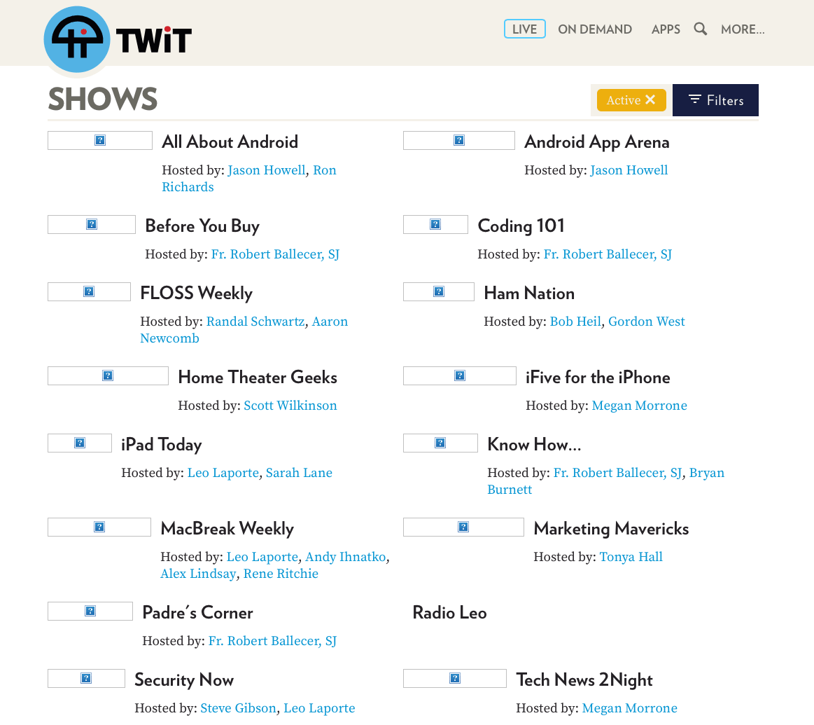

Check it out, TotalDrama readers! It’s a preview of the shitty new TWiT website. You know, the one that Leo LaDouche crows about shelling out $350K for…
2004 called, they want their web site back.
H» Quote comment
It looks like a three year old did it.
Ken Sintek» Quote comment
http://twit-development.herokuapp.com/people
Brian Bushwood? Also, da fuck does Amira Elgan do at TWiT? Get an allowance?
Jimmy Jam» Quote comment
Looks like an early attempt at a Metro UI app…
Scott» Quote comment
U-G-L-Y you ain’t got no alibi… You UGLY… You UGLY!
Poo Beard» Quote comment
WTF is with all these new sites that make you scroll down to view anything.. Page loads… Big Jumbotron, scroll down a mile to read something. Getting sick of this shit.
I blame wordpress I think.
Magic» Quote comment
This sure doesn’t look like a website that cost 350k. I wonder where that money is?
soupslurper» Quote comment
The money went into the backend, something I figured devotees of this site would know about, taking it in the backend?
Fake Molly» Quote comment
But why would you spend $350k on an API that zero people outside twit will use? But if Leo would like to spend that money on inviting people to use his backend I guess that’s up to him.
Egger» Quote comment
I seriously feel bad that Leo paid this much. It’s even worse when the pictures are on. It’s hilarious, big black boxes cover peoples faces in the pictures. The typography and color pallet is the worse! If you look at the code, there is almost no custom work, just a frankenstein of standard libraries. The API is just URL routing, which is no big deal. Oh but it does have one new amazing feature: TakeOver. Great for selling advertising. TWiT is saturated with the idea of ads, ads, ads. Ads come first for everything. It started with good taste, but it is just getting worse and worse.
Shitty site.
Dick Army» Quote comment