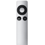
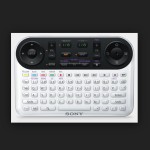
The difference between the philosophy of Apple & Google was never more pronounced then when the two companies released their set-top boxes and respective remotes. Compare these two remotes and you will discover everything about the souls of these two companies.

Apple favored simple and avoided confusion like #soup avoids trolls. Their customer’s complaints were always why can’t you; add an app store, add games, add web browsing, add anything? Apple would just say, “no, three buttons is plenty. We will give you more buttons in a few years. We eventually gave you notifications on your iPhone, and copy-and-paste, so relax kids.”

Conversely, Google could not say “no” to any function. Any engineer could walk up to the lead engineer with an idea and it would be incorporated into the product. My god, look at that thing, have they no sense of what normal non-engineer mammals are like?
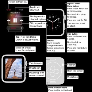
I just perused the Apple Watch guide available in iBooks and I instinctively made myself crib-notes to cheat on any surprise pop-quiz. Apple is straying too far. Tap crown, double tap crown, long hold crown, tap side button, double tap it, tap screen, force tap, tap and hold, long tap, scroll crown, swipe up, down, sideways, drag. #WTF
In 2010, there would have been zero third party apps, one button, and much less functionality. Simple.


