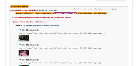
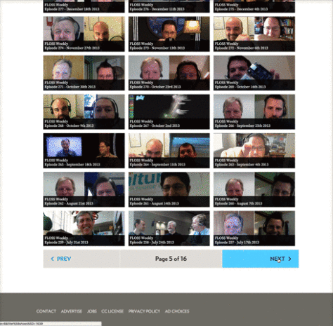
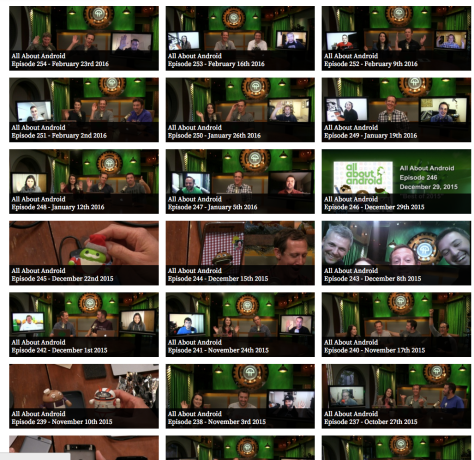
If I was the CEO of TWiT, heads would roll. Here’s why. The company wasted $350,000 on a colossal failure of a website. But I guess since the CEO is not doing her job, I decided to take an hour out of my millionaire lifestyle and give it a gander. Here is what I came up with: Hope you enjoy.


You complain about color palettes and yet you put white text on a yellow background? Interesting.
Jimmy Jam» Quote comment
Ugh why do you post stuff like this Jimmy? Don’t you see a difference between a commercial website that cost $350,000 and a self-funded blog?
Also, didn’t you even notice that everything on the infographic was also provided as clickable pictures?
Come on man, it looks so petty when someone does the “you complain about a multi-million dollar corporate operation, WHILE YOU DO SOMETHING SIMILAR?” stuff.
Also, as if that wasn’t bad enough, whenever someone says “interesting” like that, they really do look petty and small.
And you’re neither of those things, from what I see here.
evilpants,» Quote comment
Why? Because white on yellow is damn near impossible to read.
Jimmy Jam» Quote comment
That’s not what I mean and you know it. You’re comparing this site to a massive commercial website. People are allowed to criticise $350,000 websites without being perfect web developers themselves. THAT is why your post was unnecessary and pissy.
Not just that, pretty much all the stuff in the infographic was provided as large image files too.
And… Don’t you realise that there’s kind of a joke here, a piss take of how EVERYTHING is put into infographic form at the moment?
Criticism is cool; but any time anyone says “you say this about Twit, but you do the same” they lose the argument. Twit has 25 employees and spent a fortune on its website. This is a tiny self-funded operation that makes no money.
evilpants» Quote comment
Go see a doctor, you seem hideously distraught over a non-issue.
Jimmy Jam» Quote comment
I wish Leo would apologize for inspiring so many to use Drupal back in the early days of TWIT.
It really is a shit product seemingly specifically designed for webdevs to cash in on feckless corporations once they take two steps in and can never get out. Leo is obviously a poster boy for this scam, and should admit it.
It was and is an “open source” con job, and should never, ever be considered as a viable platform for personal or small business use.
I started with it back in 2007-2008 because Leo was supporting it as viable just by using, and sadly back then the whole future of TWIT seemed fresh and exciting, so I actually respected his opinion back then.
BIG FUCKING MISTAKE!!!
Not only was Drupal one of the most painful web platforms in the world to use, that very complexity made it nearly impossible to move away from.
I’ve had to completely rewrite my site in a static site generator just to get away from that crappy performing piece of garbage.
The amount of requests and resources needed for displaying a single page would bring the site to its knees on even the lowest traffic sites, so you’d have to buy all of this extra ram just to run the damn thing since it had no intelligent caching mechanism.
I can easily see how Leo wasted $350K and still couldn’t get what he dreamed of and wanted out of it.
Drupal is a scam, a vast welfare program for scumbag webdevs who are committed to refusing to live honest lives.
I’d feel sorry for Leo about it if he hadn’t proved to be one of the biggest douchebags in the western hemisphere over these past 8 years.
I don’t even listen to Security Now anymore (for about two years now), even though I consider Steve a gem, all because that idiotic douchebag runs the show.
I mean, the same douche who chose Lisa is the same douche who chose Drupal.
Lesson learned!!!
Drupal Lover» Quote comment
“slow_golf_clap.wav”
y0y0» Quote comment
SquareSpace then?
TYFYC.
Ken Sintek» Quote comment
I bet across all the different podcasts I’ve listened to in my lifetime, I’ve heard the squarespace ads over 5000 times and have never once considered using it.
I have no idea how I was immunized from it, but feel so sad for those who fell ill to it.
Drupal Lover» Quote comment
SS is fine for simple sites. 8 bucks a month and you’re on the web.
Lisa’s Cunt» Quote comment
I have to disagree, Drupal has a bit of a high learning curve so it isn’t for everyone. Depending on your needs for web development it can be overkill so if you expect it to be as user-friendly as WordPress, just look elsewhere.
thoughtpolyp» Quote comment
I’m not talking about “user-friendliness” whatsoever, I’m talking about performance, and the expense of it for large corporations compared to small businesses where even $350K can’t buy someone the functionality they requested from the creep drupal shops selling them on wide-eyed ambitions.
Just watch how the user uptake of Drupal 8 never reaches that of Drupal 7 as people start to reject that could con-artist framework in favor of purpose built sites and applications.
They’ve been busted.
Drupal Lover» Quote comment
Here is what most of us — I include everyone — are baffled by. With a major sponsor called Square Space, why did Leo essentailly say Square Space sucks by developing a Drupal site. WHY? They are sponsors, Drupal isn’t!
Everyone KNOWS that if Leo had gone to Square Space with the promotional idea of putting his entire site on a Square Space site that the company would have developed it for him for free. AND it would have been kick ass.
And Leo could then leverage his sales pitch by yakking about how his advanced site was a Square Space site.
But no, from Lisa’s pea brain perspective, this Kitchens operation would be the way to go. Experts in Texas. Let’s go there. It also points out how she sucks at sales not seeing how they could leverage a client with a great promotion.
And yes, the Twit website is lame and amateurish looking. Good work assholes.
Lard Ass» Quote comment
Great work. I mean actual work. I think you put more into this than Leo did during the painful gestation period for his terrible site.
Somewhat akin to Ghost Dog discussion of CEO Corner and the ongoing coverage of that Costumed Guy (who may or may not be an actual priest), this is great stuff.
Ha Ha ha» Quote comment
Great review !
The text in the thumbnails is asinine. They must hate people from
the eyes/nose on down or like the gangster look with the lower face covered.
The redundancy is silly. I would assume you would stick to one format for all the NetCasts for the most. I’m surprised of the limited choice where you can download them iTunes/YouTube ?
The whole site is not user friendly by any means.
Does anybody even use it ?
Joe Shoe» Quote comment
So, I ran the same web checker on TotalDrama.Net. 629 potential problems, so Total Drama wins! And it didn’t cost no $350,000.
Leo Laporte» Quote comment
Really excellent post, Deez. It’s always worth looking at what supposed tech leaders do with their own websites. I mean, the guy has heard hundreds of people talk about web usability, accessibility, page load times, redundancy, and yet he couldn’t even be bothered to take a lead with his own, expensive website.
One of the joys of getting to be in the position Leo is in is that you can direct your own time. Imagine if you’d built a successful business and were now in a position to spend $350,000 on your own website. That’s something you could devote a load of time to. You could ensure that all the best accessibility practices were followed. You could take a lead in offering lean, fast web pages, using really forward-thinking design.
It should be a really fun thing to do.
evilpants» Quote comment
The whole “headless Drupal” stuff could’ve been good. The idea of a website as a service, offering data in a variety of ways, is great.
But he’s failed in every way. Failed to make it worth using, failed to promote it, failed to provide a reason for people to use it. The majority of the $350,000 cost was for the creation of this API – it’s a very complicated piece of programming, compared to the code for an actual website.
And it could’ve been great:
In London, our metro provider led the way in offering data to be used however people want it. They created an API which has data on every aspect of trains, buses and roads. You can find out exactly which signal every train is currently at, how long it’ll take to get where it’s going, where it’s been etc. Same with buses and with road disruptions. It’s truly excellent and has led to a worldwide market in transit apps.
The point is, if you’ve got data that people want, offering a structured programming way to get that data is a great idea. More media organisations should do it. If Twit really was growing and really was becoming the CNN of tech, the API idea would’ve been great.
But it’s not. The limits on use are ridiculous – I signed up to be a developer just to test it out, and you’re only allowed to make FIVE data requests per minute. Which means you can’t even offer an app cos as soon as you get more than 5-10 users, you’ll be locked out. It’s an absolute joke.
evilpants» Quote comment
Yes, this is further proof that Leo and Lisa have been scammed and are clueless.
Lard Ass» Quote comment
The site is shite. The audit just confirms what we already knew and the famous API is a ridiculous joke.
Soup needs to hang it up and close it (TWiT) down.
Ex-Fan» Quote comment
I keep checking here for the big, “GOING OUT OF BUSINESS”, announcement regarding Twit. I refuse to give them a click. They look to be falling and falling fast though. Great job and fail fast.
Norton/Morse BS Show» Quote comment
Some TWiT shows are topic-based and the episodes have descriptive titles.
Whoever designed the episode browser decided that such titles are inconsequential information, and what really makes episodes *POP* to the interested party is incrementing numbers and dates: https://twit.tv/episodes?filter%5Bshows%5D=1639
Woah: one down, four across… is that episode number divisible by 9?! Seems like a must watch!
LOVExLIGHT» Quote comment
Exactly: I mean in 2 min. I can come with a better design. But Leo doesn’t seem to care about his own site to spend 2 min. thinking about it.
How about only one column of shows on the left with a description on the right side of it?
Also, infinite scrolling would be a more modern approach. Preload the next screen using AJAX while the user is looking at the current screen. This is not rocket science.
This is lazy unfinished work.
Deez_Reports» Quote comment
No. Infinite scrolling is a terrible user experience.
kelso» Quote comment
Yeah I really hate infinite scrolling. Also, it’s often terribly designed – you get websites that have options only at the bottom, and you can never get to them until you’ve infinitely scrolled through all the content.
evilpants» Quote comment
Hey Deez,
Fine work sir. I got something for you.
https://gfycat.com/TotalDisfiguredAngelfish
TYFYC.
Ken Sintek» Quote comment
That’s fucking AMAZING.
TYFYEVERYTHING!
evilpants» Quote comment
I am no computer guy but the four headings “Latest, News, HelpHowTo and Reviews” do not fit on a semi well used device like the iPad.
https://www.dropbox.com/s/u6iai8tfk0zpcwv/Photo%20Feb%2029%2C%208%2026%2000%20AM.png?dl=0
And why even have “latest”, it’s the same as a column over, none of the heading make sense for most shows.
Those Hero images that are blocked out by text are supposed to be updated. Could have had fun with that. Even lets fans contribute but it’s the same stupid images.
And he is so proud of his apps but it’s the same apps and devs he has had for 10 years. There is no need for two Apple TV apps if one is good let alone 4 useless apps
Diet Soup» Quote comment
Ridiculous that it doesn’t resize for iPad.
lol they claim they’ve got new mobile apps in development. They’ve been saying it since early last year…
evilpants» Quote comment
……Continued
This is another case where if he had a qualified CEO to challenge him he would have gotten feedback. Instead he has a CEO who worships him and only likes pretending to be a business person and wear heels around the office the clang when she walks.
It’s too late now, if she gives good head, might as well keep her at this point. This last move should bury them.
Diet Soup» Quote comment
I’ve said it before and I’ll say it again, $350k for that twit “headless drupal” website is a colossal waste of money. Could have done a website with SS for $8.00 per month and we all know “you can’t bring a SS website down” no matter how many concurrent visitors you send to it, lol. LL is more concerned with his mason jar “salad shakers” nowadays rather than tech, smh.
TYFYC
Mark Pugner» Quote comment
“$350,000 dollars” reads as “three hundred fifty thousand dollars dollars.”
JRy» Quote comment
Thank you for your correction JRy.
Deez_Reports» Quote comment
Oh, one final irony. The old cheap site was better and easier to use.
Lard Ass» Quote comment
Hope someone caught the gem attention hog LL just dropped by scolding Jason Cleanthos like a little child live on air just before start of triangulation, talk about cringe worthy… A must watch!
Mark Pugner» Quote comment
i went to the dvr and saw that and was classic. leo is a attention whore but then again so is effendumb. nobody watches twit for effendumb hes annoying and makes twit that much more unbearable. he was doing stuff like that all the time when gum was doing tnt. it was hilarious leo whining that the camera wasnt on him though .
yup» Quote comment
where do you find this rant on the dvr
David» Quote comment
I could not find it either..hopefully someone clipped it
Headless Drupal» Quote comment
The pig just said on TWiT, ‘it’s sometimes hard to squeeze it in…. that sounds dirty’
What a f’ing pig. Family friendly? LOL!
Ex-Fan» Quote comment
First time using the DVR.. watched the Feb 29 Triangulation preshow.. here are some comments..
3:00 – Leo shows his new Samsung Galaxy S7 Edge (he got two; one for “personal consumption” (i.e. dick pics??).. later says ” I love when I get boxes from B&H”
4:20 – Jason has his mic on and starts to tell a story but Leo cuts him off and tells him to turn his mic off and put the camera shot back on him .. “Switch camera to me, turn off your mic.. That isn’t what we should be streaming right now” and then starts to slurp down a drink.
5:52 – Leo: “These are important interviews. These are going to last forever.”
8:15 – Leo: “Our business credit card.. Bank of America just randomly turns it off for charging anything.”
10:30 – Leo: “I have better than banker’s hours. I get here at 11 and leave at 4 (laughing).. Five hours on the air is a lot of time.. although the way I do it, it’s just really not, it’s just sitting around and talking.”
10:40 – Leo runs through commercials.. Automatic, Igloo and PillPack (for his rapidly aging viewers base I assume)
11:10 – Leo relates story of Steve Gibson sending him a box of “sleep supplements.. all sorts of weird stuff.. he said it’s not a sedative.. you will just feel really relaxed”. Mmm “drug dealer” Steve Gibson
Benny Hill» Quote comment
Why does ANYONE need sleep supplements? Unless they are not sleeping well. So thus Leo is not sleeping well? Why? Something must be bothering him such as his lifestyle choices.
Headless Drupal» Quote comment
Funny how he’s fully aware of the staff around him saying anything inappropriate, but for him with a live feed? Not so much. (unless he’s -finally- getting it and is trying to change his behavior… bahahaha.. I kill me.)
Esch» Quote comment
Come now, the website works perfectly. It is designed to be as bad as an old myspace page with the bonus that it deters people visiting it.
What more could anyone want?
Lisa’s Labia» Quote comment
Why does there need to be a public API for the website? What interactions, other than the RSS feeds would 3rd part applications need?
Live audio/video is available via HTTP or HLS from published CDN links
Archived audio/video is available from RSS.
Other published content (blogs, articles, etc) should be available via RSS.
Chat room uses published IRC information…
One can build a Twit viewer application using all the above without any specialized APIs….Why current web “developers” feel like they have to use MBs of JavaScript frameworks to even do a “hello world” website is beyond me. Most of what is on Twit.tv can be done server side and served to the browser using optimized HTML….if one needs a few simple interactions, there are many “micro” js libraries to perform common tasks, see http://microjs.com/
EGF» Quote comment